Flyer Intro

TRAILS

A website that acts as a communication platform between University coaches and school professional to share TRAILS program documents. School Professionals execute the TRAILS program on K-12 student (in Michigan only) to treat them from mental health. This is a cross-platform website on desktop, tablet & mobile.

My Role

I was the Lead Product designer for this project. I planned and conducted generative & evaluative end-user research.

Analyzed qualitative research data to deduce insights to design sitemap, sketches, wireframes, brand & style guidelines including icons and visual design.

Tools I used are Adobe Illustrator, Photoshop, Sketch, Invision, Zeplin.

The Problem

Poor UX in Old website

The old website had usability issues. Users felt lost in navigation, browsing & searching for program documents was complicated, esoteric jargons which resulted in lack of clarity on how to use the program documents, a cluster of unorganized documents, broken document links, pain in accessing documents, etc. In the end people felt unmotivated in using & visiting the website.

generative research

  • Planning & running user-centered requirement gathering workshops with stakeholders (3-4 people) to understand requirement & their expectation.
  • Interviewing users (6 people) to discover the challenges in their journey and understanding their needs & goals.

Understanding domain

Requirement Gathering

Requirement Gathering Requirement Gathering Requirement Gathering Requirement Gathering Requirement Gathering
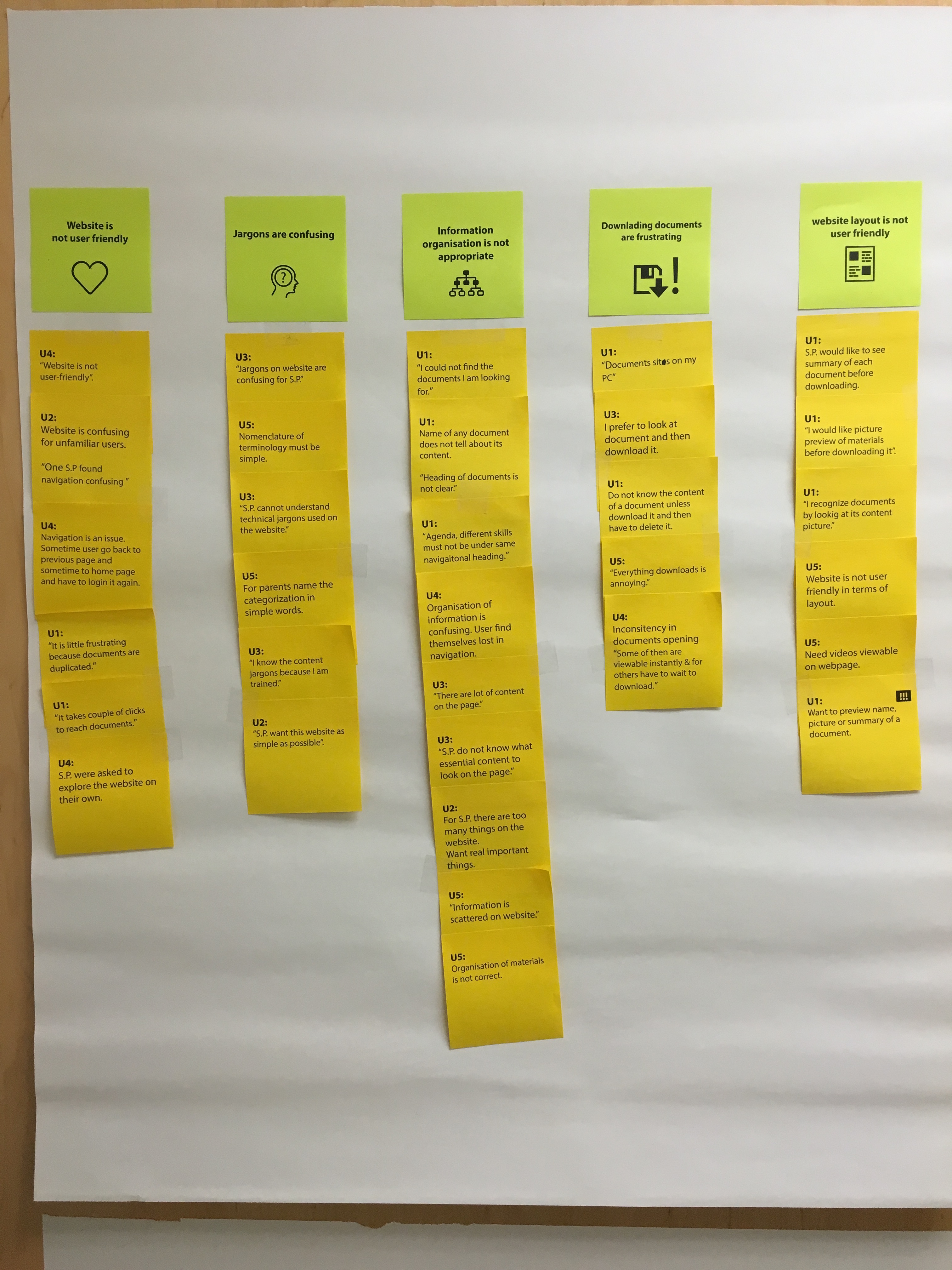
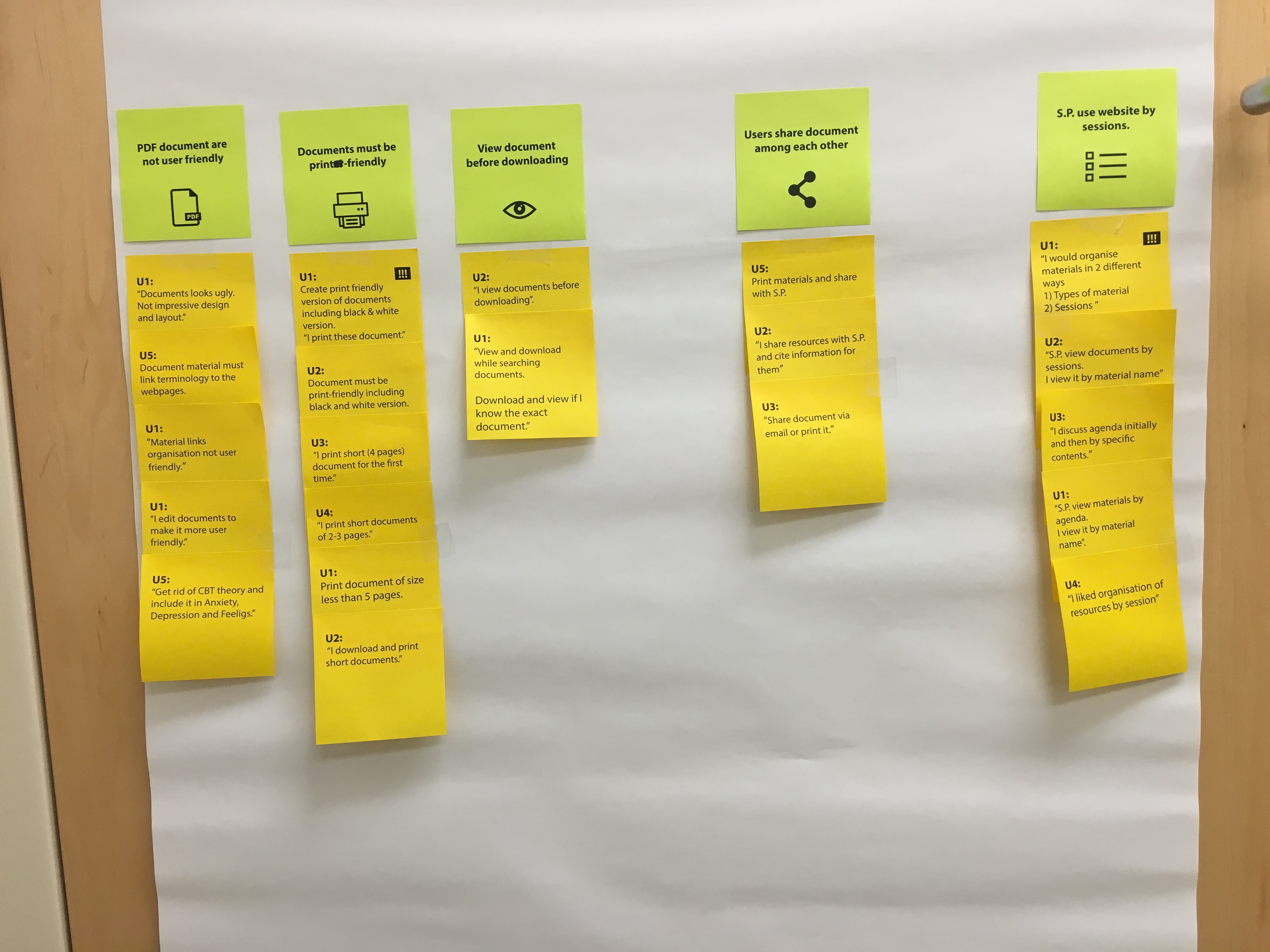
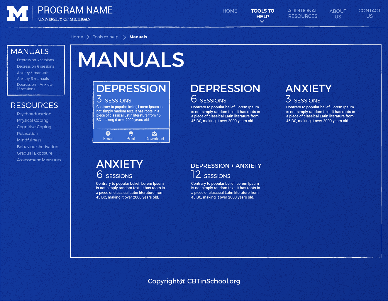
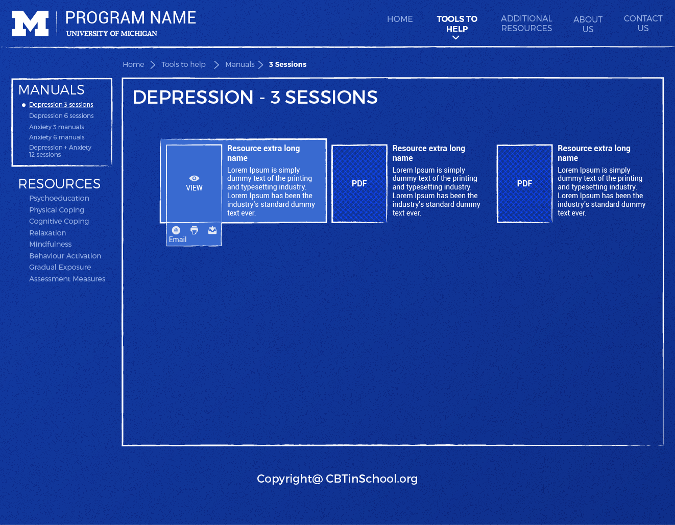
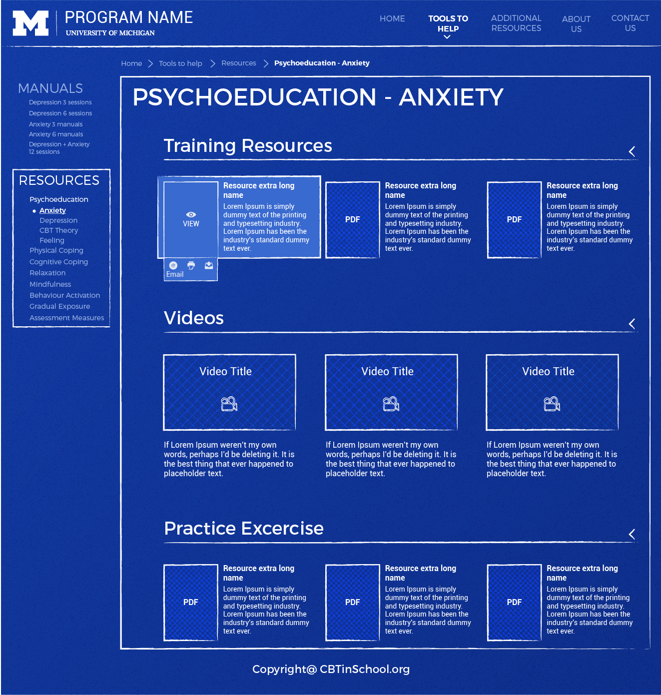
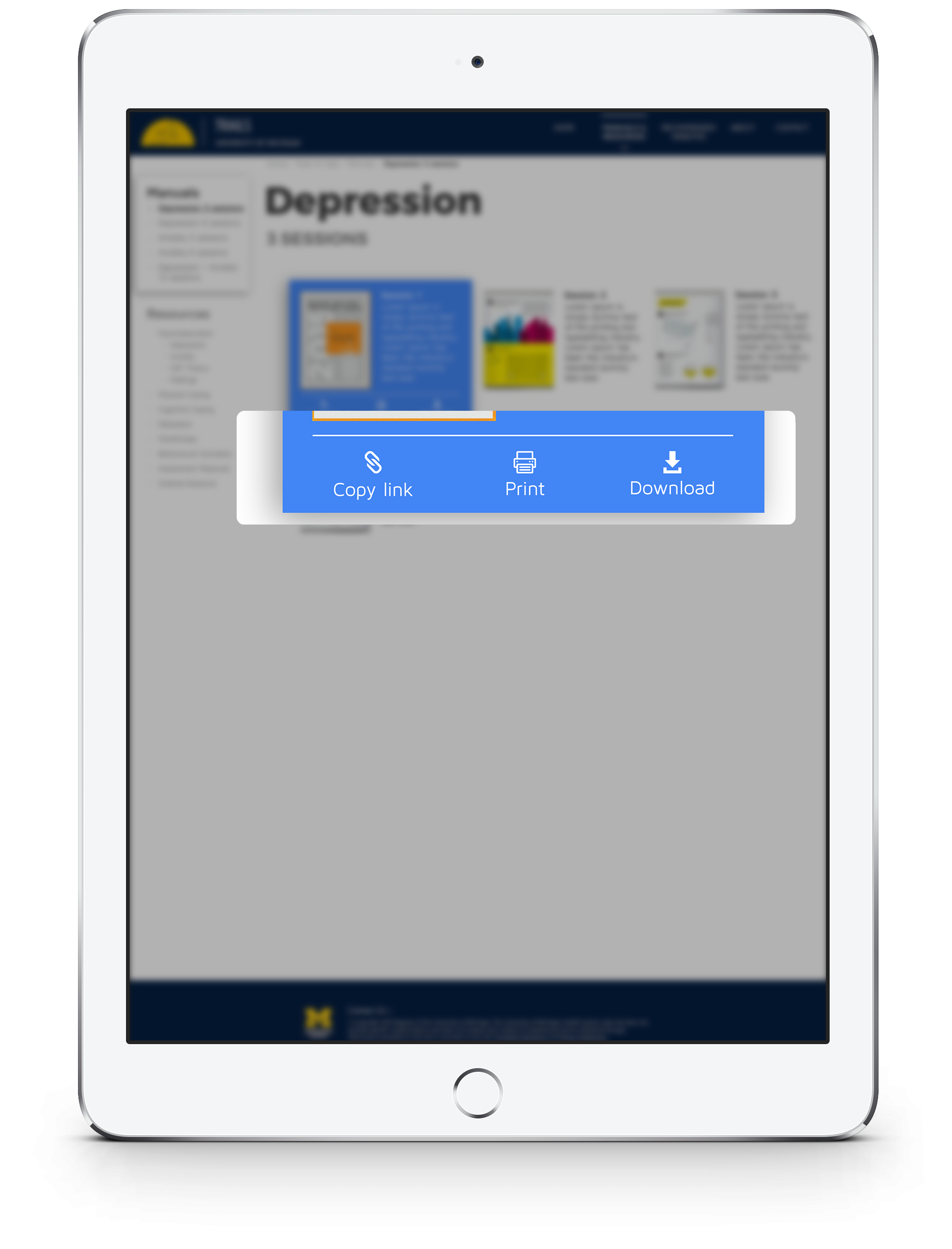
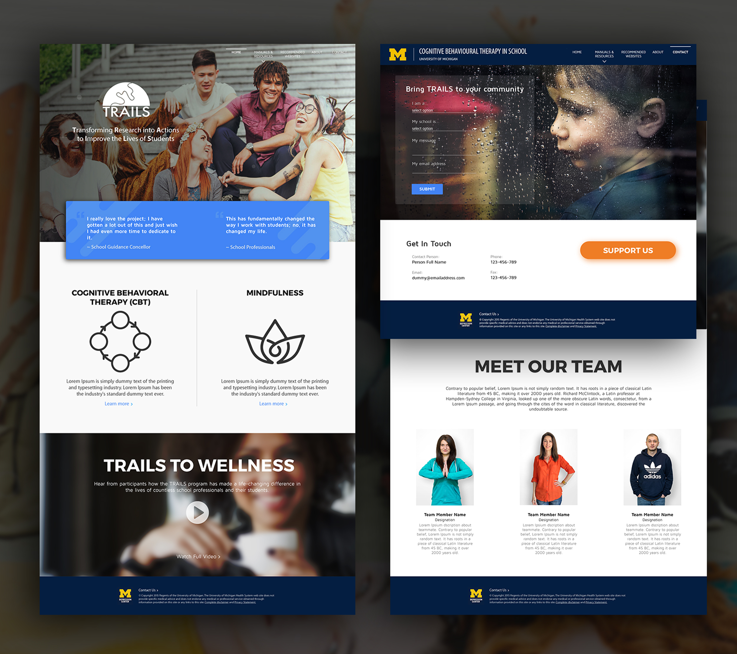
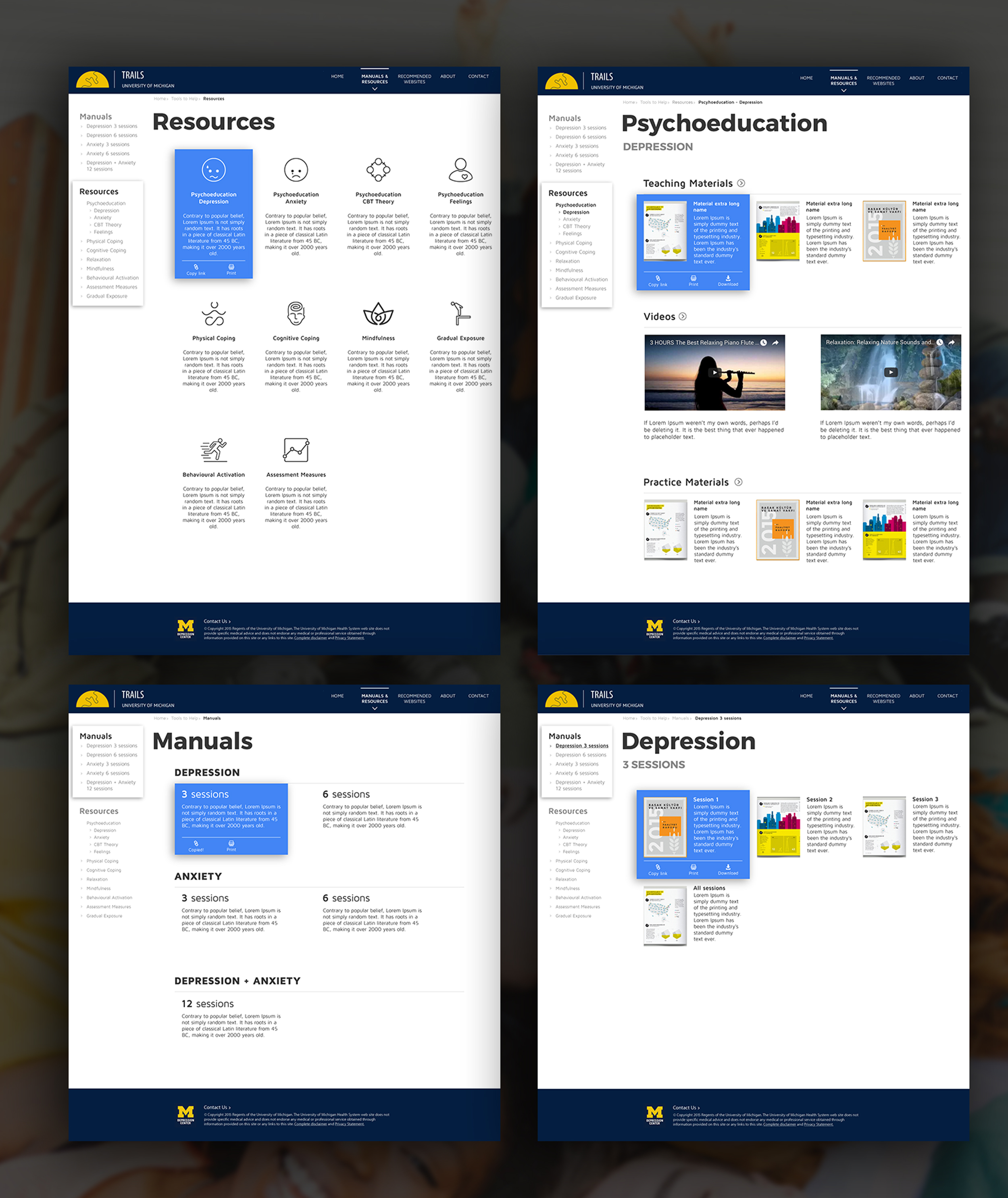
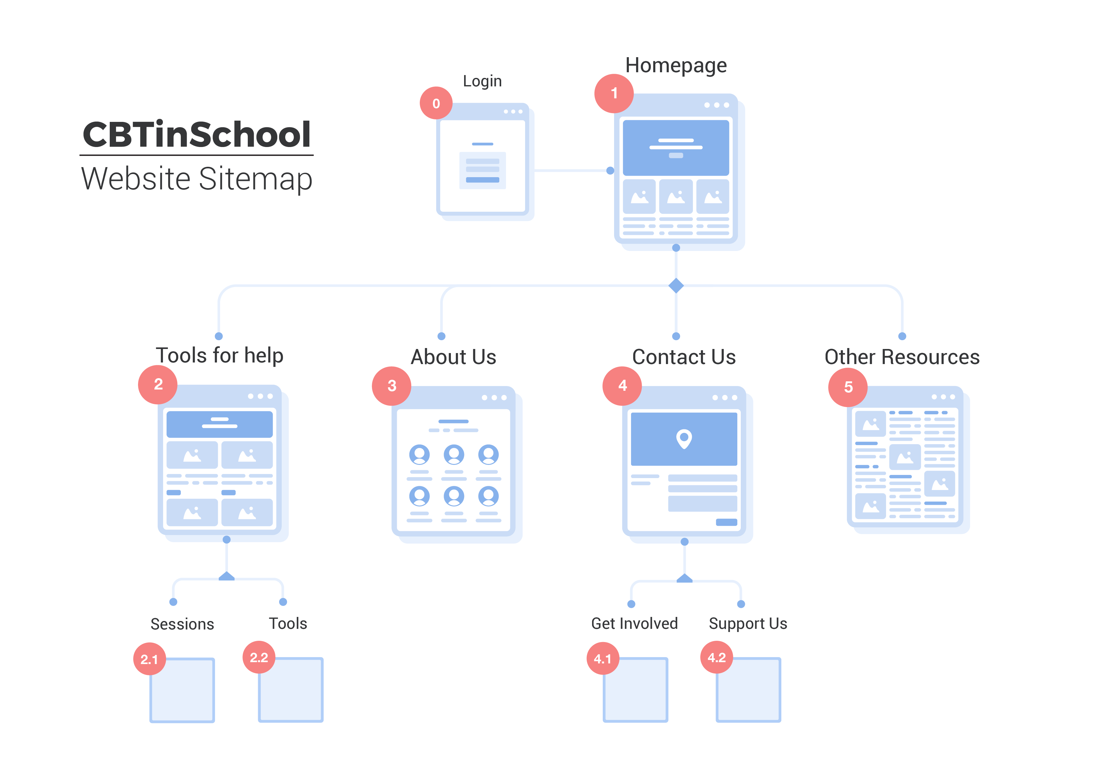
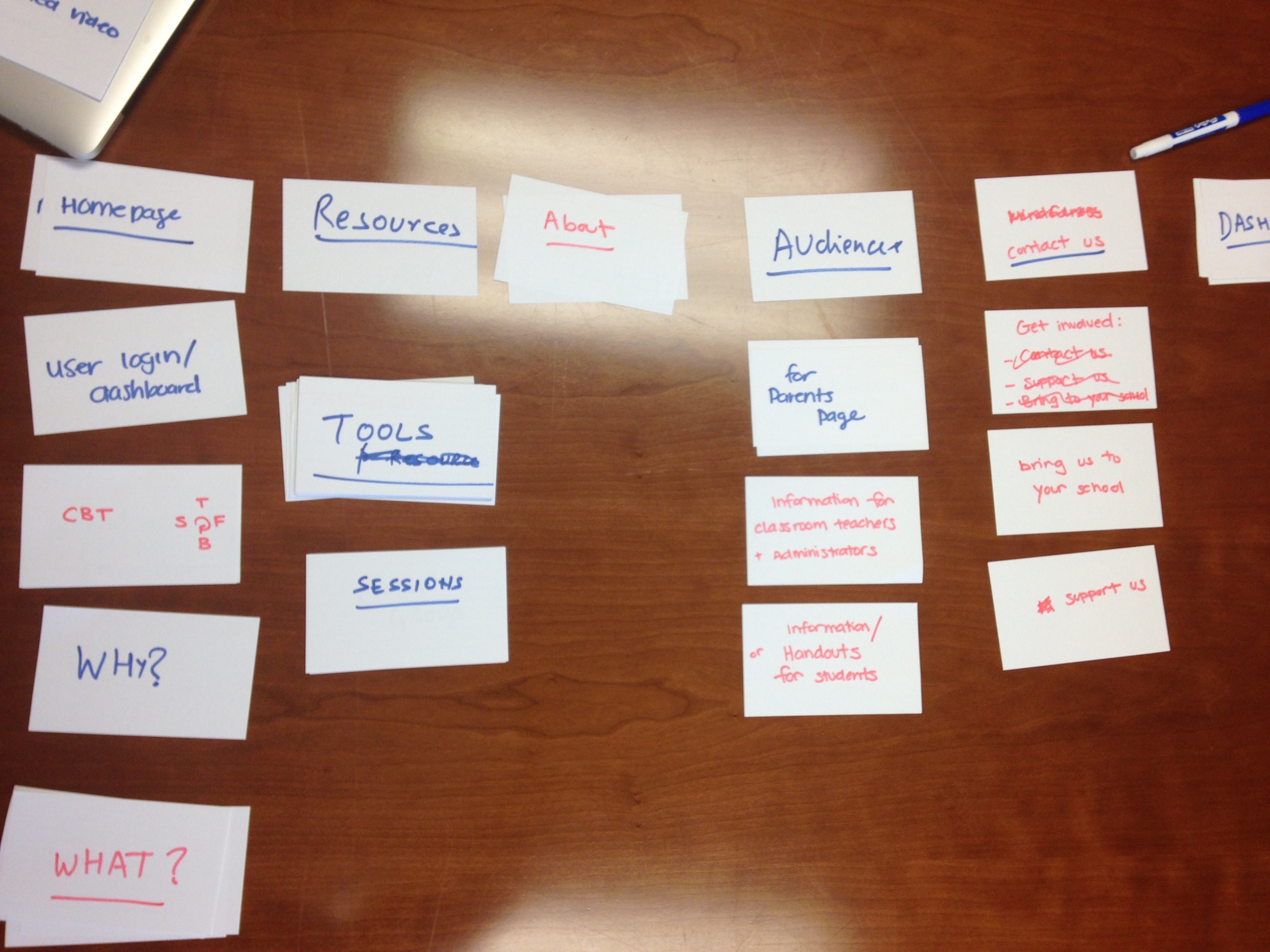
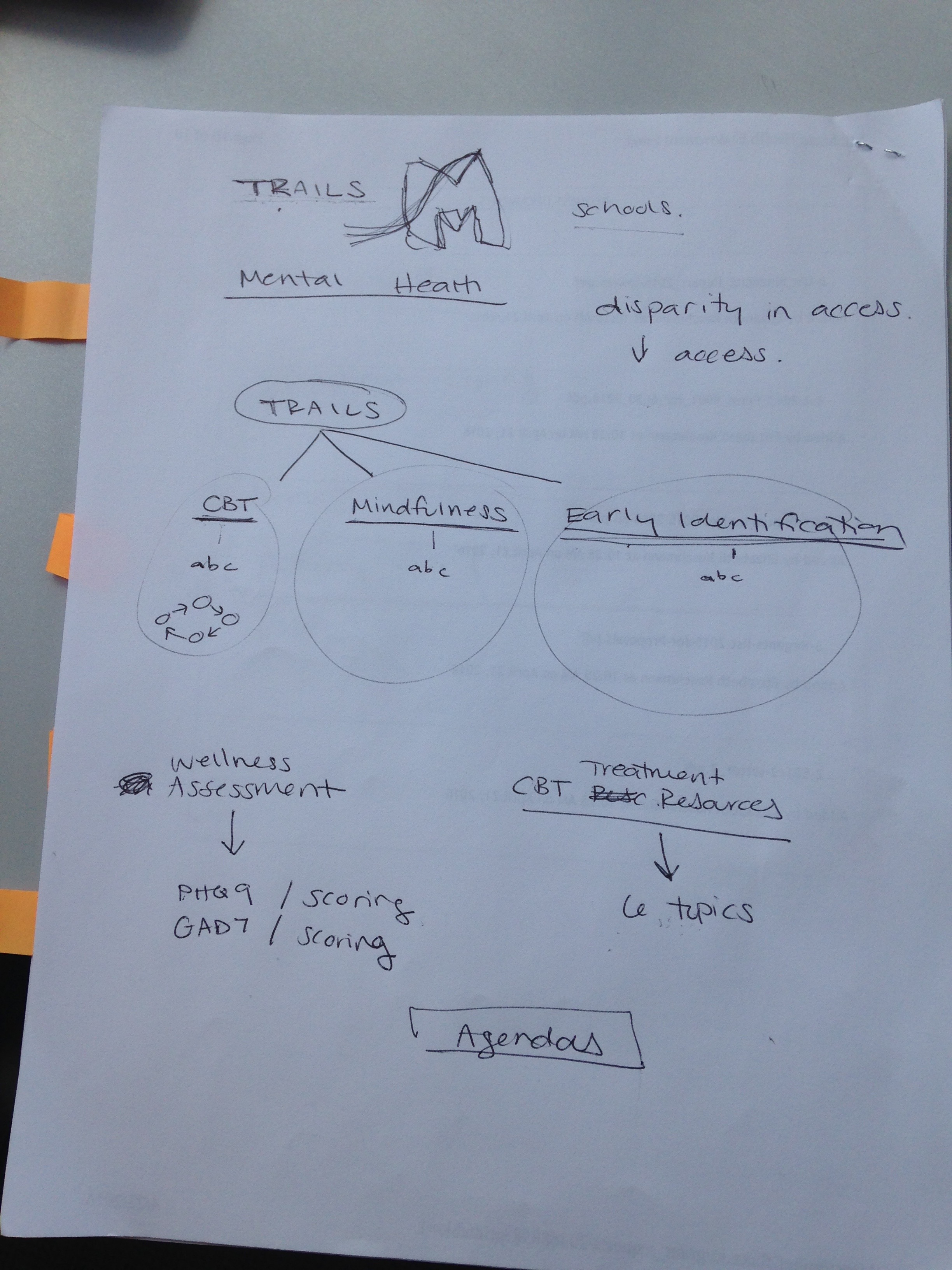
  • Planned and conducted card sorting workshop with stakeholders (3 people) to gain understanding of domain and information architecture.
  • It helped me find a structure & content of website, label categories and navigation, and decide what content goes on each page.
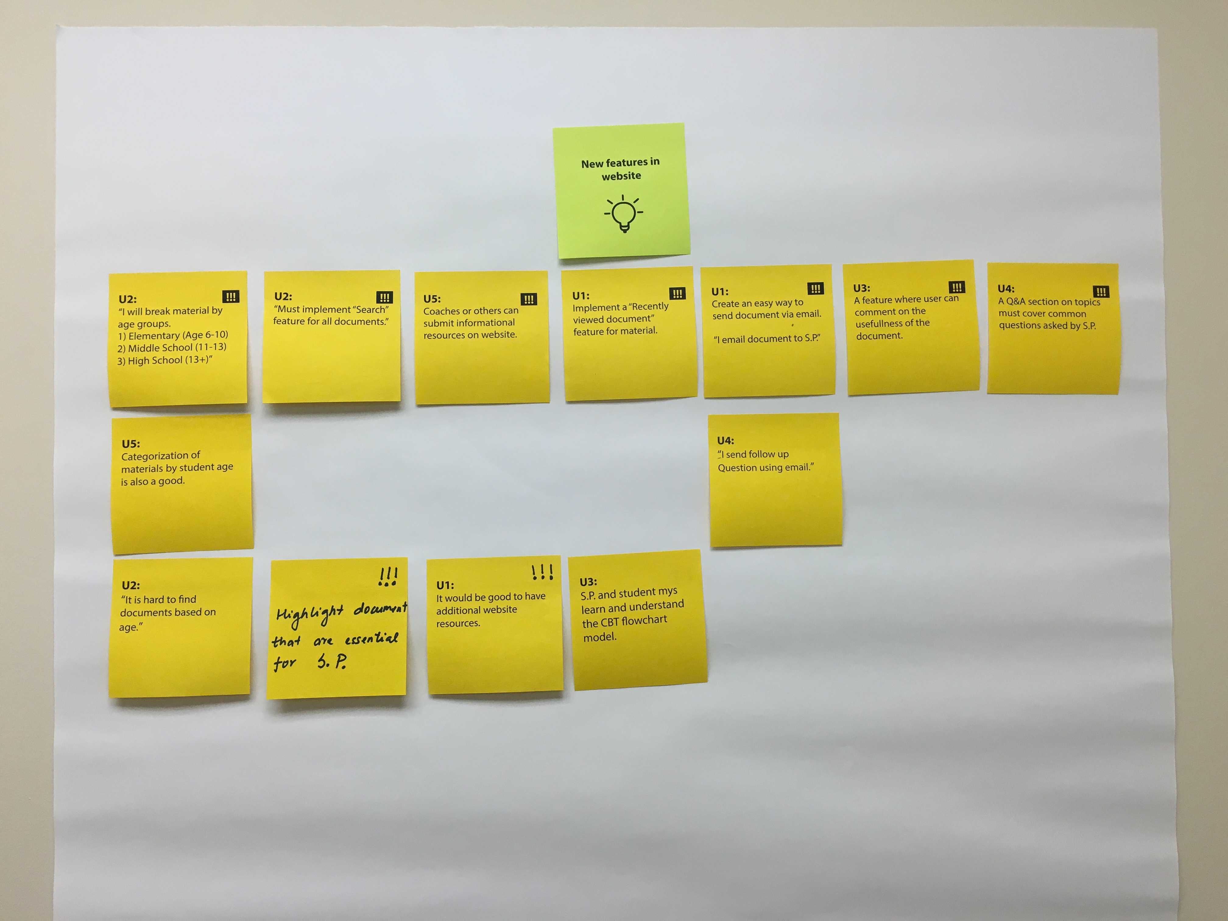
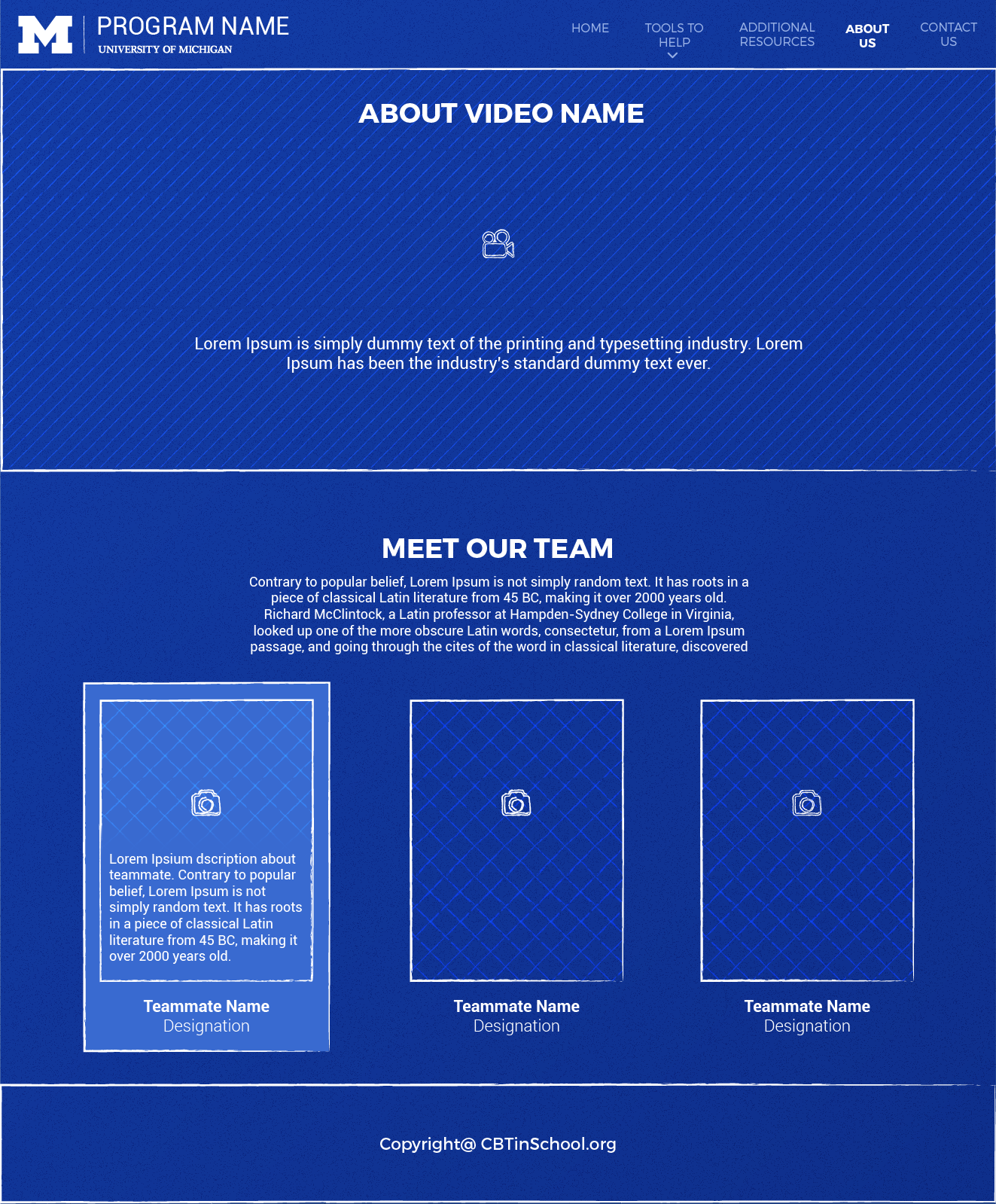
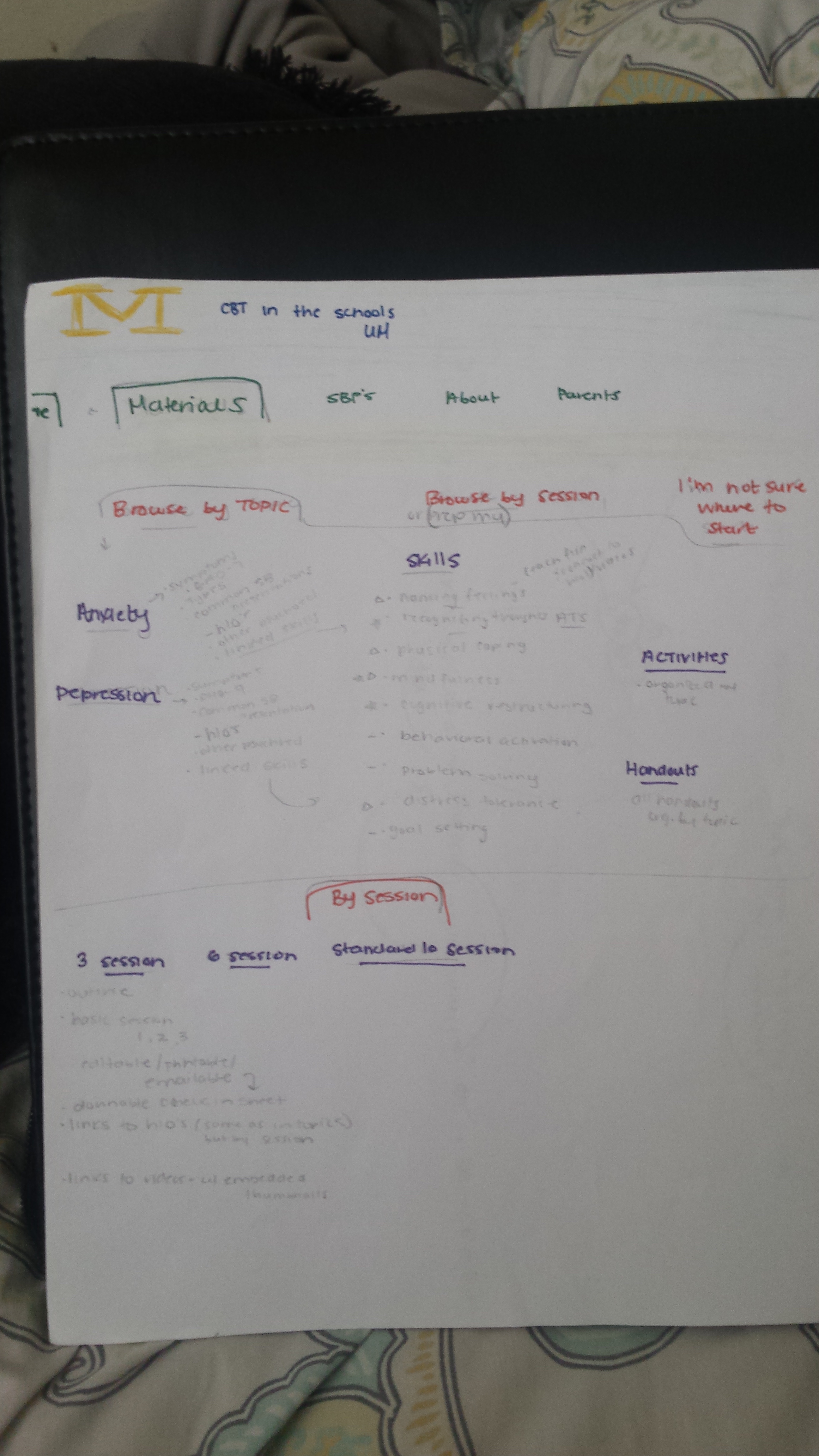
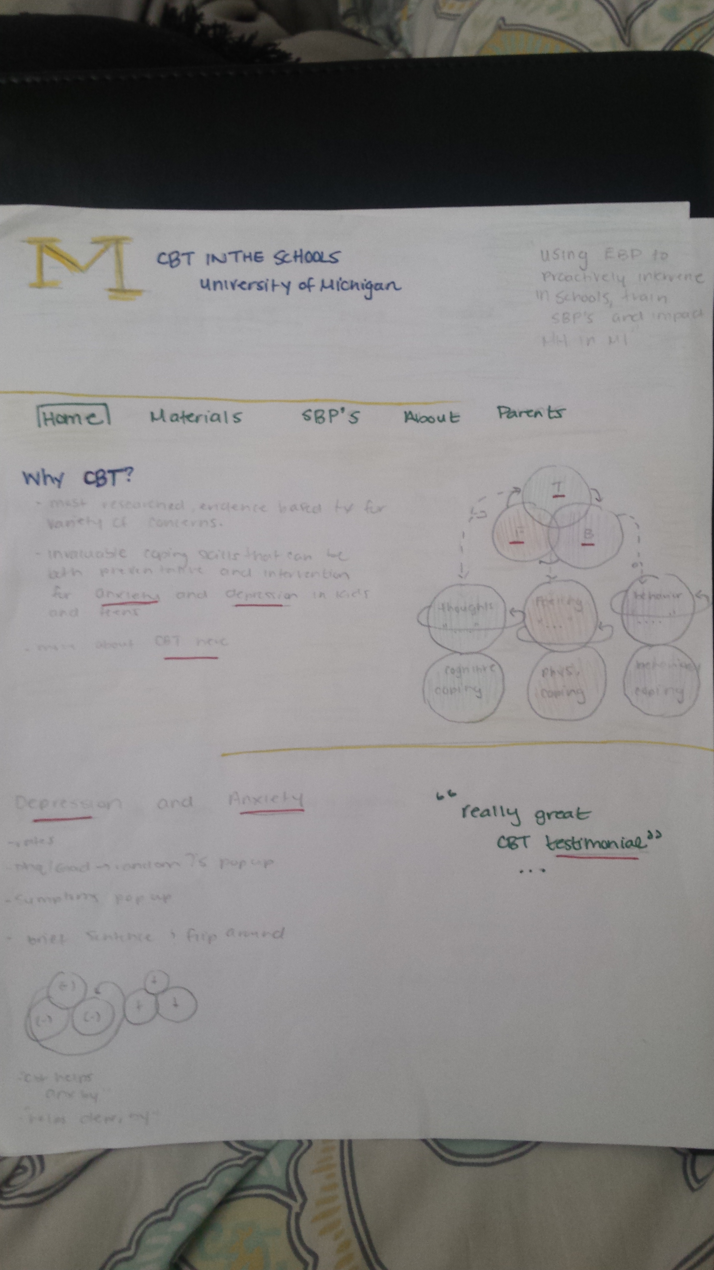
  • Planned and conducted participatory design workshop to uncover new ideas priorities, and flows.
  • The outcome was it provided me a quick & clear understanding about needs of stakeholders and users.
Benchmarking UX/UI standards

Comparative Analysis

Requirement Gathering
  • Conducted comparative analysis to get a better understanding competitor in the domain. Selected 4 out 6 competitors to study because they had the similar target audience, market organization vision.
  • I choose 8 parameters to rate our competitors on a scale of 0 to 4 and plotted them on Spider graph.
  • The stakeholders (4 people) had rich tribal knowledge in this domain. To discover it and understand expectation I planned and executed a comparative analysis workshop with them.
  • Key findings were, organisation of documents was important, maintain optimal text detail, & aesthetics must be neat.
discovering challenges

User Interviews

UserInterview UserInterview UserInterview UserInterview
  • Conducted 6 user interviews to discover the challenges in journey while using websites. Participant were chosen based on their role (4 university coaches & 2 school professional) and experience in this domain (2 experience, 2 mid-level, 2 amateur).
  • To obtain information about the context of use, and how university coaches use the website I conducted contextual interviews.
  • Questions asked were on demographic, how & why do they use current website, what motivates them to visit competitor website, list of other favorite websites outside the current domain.
  • Created affinity diagram to understand the types or problem users were facing and what is the root cause of the problem.

Research Insights

Inception Icon
  • User feels lost in navigation.
  • Jargons on website are confusing.
  • Organisation of information on website is puzzling.
Design Icon
  • Sharing of document resources is prime interaction among users.
  • Interaction with documents are frustrating.
  • PDF resources are not user-friendly.
Technology Migration
  • Most of the users use Windows operating system
  • Mostly users come on the website and share documents among each other.
  • User had problem accessing the documents.
Scoping & Refining

Rendering User Needs

Sketching Sketching Sketching Sketching

Sketching

What did I find ?

Sketching helped visualize the site flow.

After few iterations I narrowed the scope to the most basic needs.

Wireframe Wireframe Wireframe Wireframe Wireframe Wireframe

Wireframe

What did I find?

Clarification on website features.

It helped me push usability to the forefront.

Concrete site map was finalized.

Presenting TRAILS

  • Attacking the user challenges and solving it.

Easily Save & Fetch Coupons

no more lost in navigation

User were feeling lost in website because of elusive wandering left-navigation.

To fix this I added organized left-navigation and breadcrumb.

Easily Save & Fetch Coupons

Structured & organized documents

Documents was cluttered and unorganized in older website.

I organized the documents into two different sections. School professionals usually browsed in Manuals section and university coaches’ favorite section was Resources.

View details of any ads

Browsing made easier

While browsing for right document users had to download it to view it. Their downloads folder was overloaded with duplicate files.

To solve this problem, I added first page of document as thumbnail so that user do not have to download it and can make a quick guess by looking at the thumbnail.

Design Decisions

  • It’s not easy to talk about design. Every problem has 'n' number of potential solutions.
  • It was difficult choosing a best among these infinite solutions.
  • However by following good UX practices and focusing on users' need I was able to win on the challenges.

Don't make me think

Adding Prime interactions

The prime purpose of university coaches & SP to visit the website is to share a document by sending links in email, printing and sharing physically and downloading to read it.

To speed up their process of work I added these three prime interaction on hover of each document.

Feedback is important

Without feedback

When user clicked the Copy URL link they were confused whether the url was actually clicked or not.

vs

With feedback

Adding feedback on interaction made user gain trust on their interaction.

Usability testing

Intuitive "Show More"

Incorrect Position

To keep page length organized, I decided to show only 3 documents in a section. However, during usability testing, I discover that "Show More" button was not intuitive to the user as they cannot locate rest of the document.

vs

Correct Position

I repositioned the "Show More" button and added a visual clue by showing a sneak peak of the remaining document.

Usability testing

Quick Sub-Menu

Small Menu

Small drop down Menu was a two step process to reach a desired section in the website.

vs

Big Menu

Two make this two-step process into one I added left-hand menu into the sub-menu. This gave users access to quickly visit all the sections of the website.

View it Live

Behance Portfolio
All works
InTune