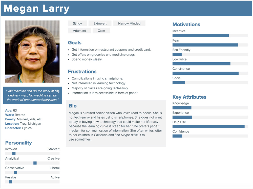
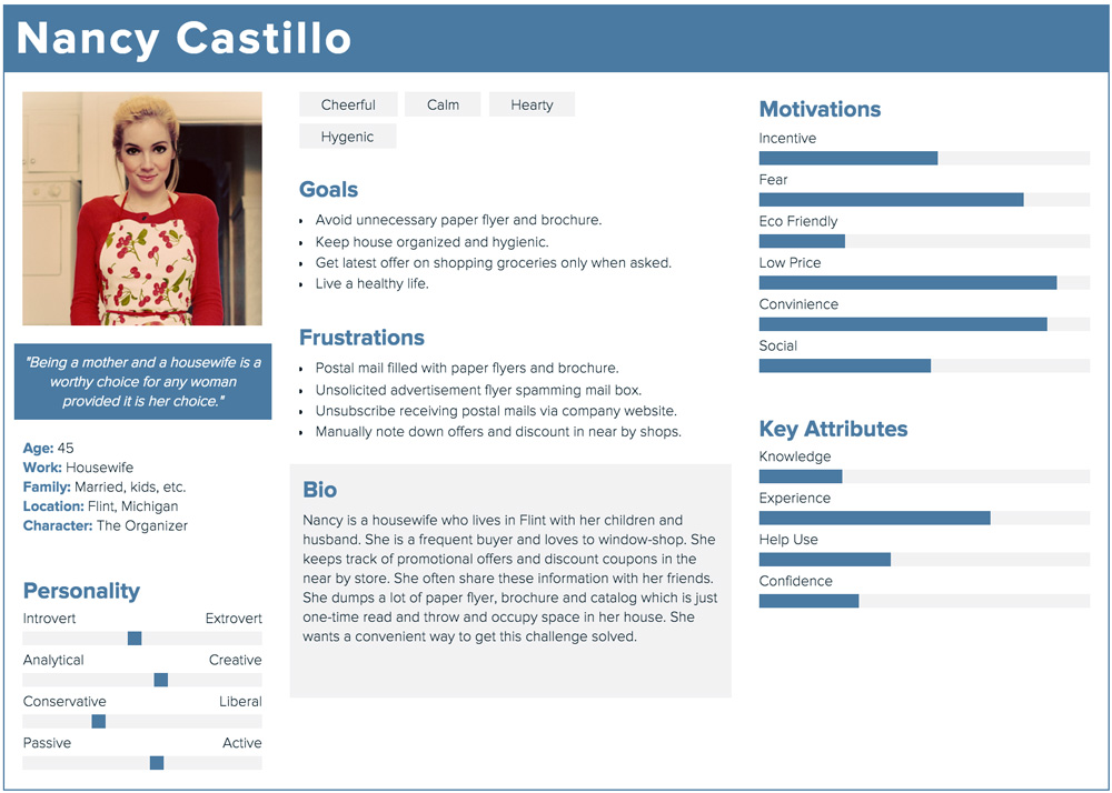
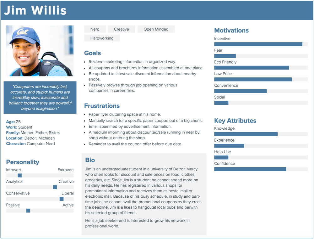
- User want reduced unsolicitated mails in their mailbox.
- Marketing information must be curated to users' needs.
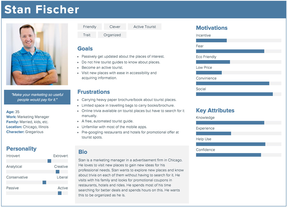
- Users needs to be informed at the right time and location.

Flyers
Location-based advertising.
The Problem
Cluttered mailbox!
Unsolicited flyers, brochures and coupons clutter our physical mailbox. They are one time use & throw marketing tool and therefore it is an environmental and economical problem.
My Role
I did this project independently. The tools I have used for creating wireframes and visual design are Adobe Illustrator and Photoshop. I created the interaction using Principle app.
User Research
Discovering Needs & Goals
Research Insights


- Convenient way to organization marketing informations.
- Saving & fetching of mails must be fast.

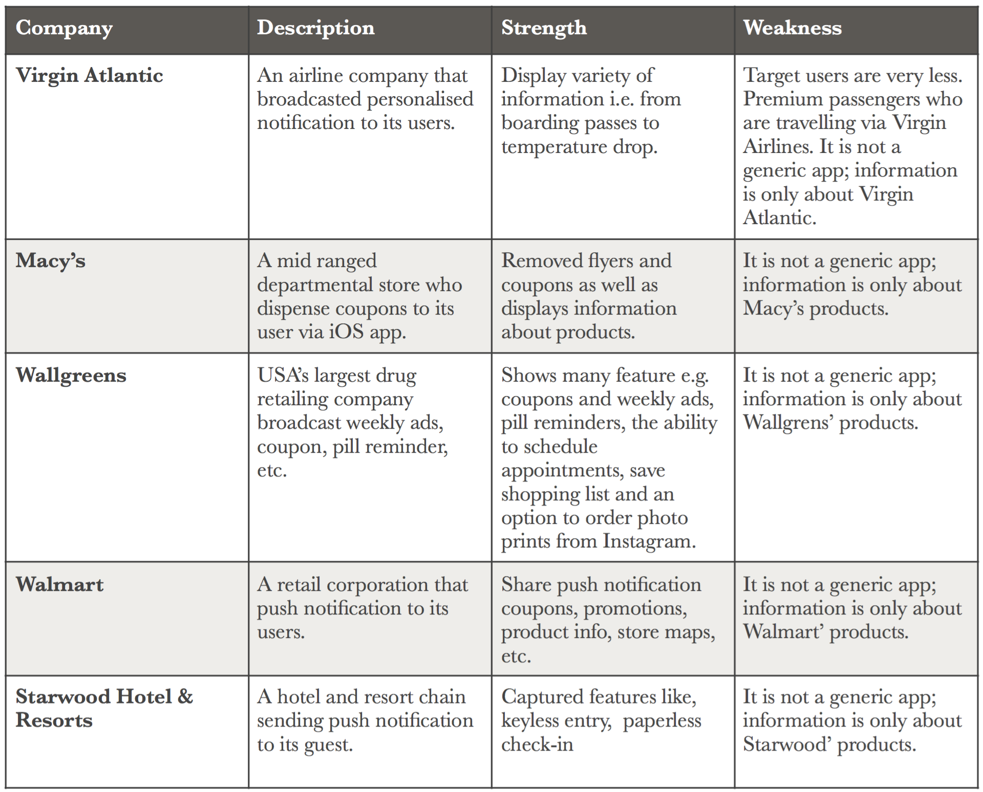
- Every company broadcast their marketing information in their own app.
- No generic app exists that curate marketing information based upon users' location.
Scoping & Refining
Rendering User Needs
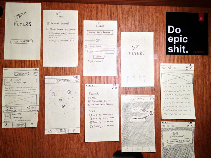
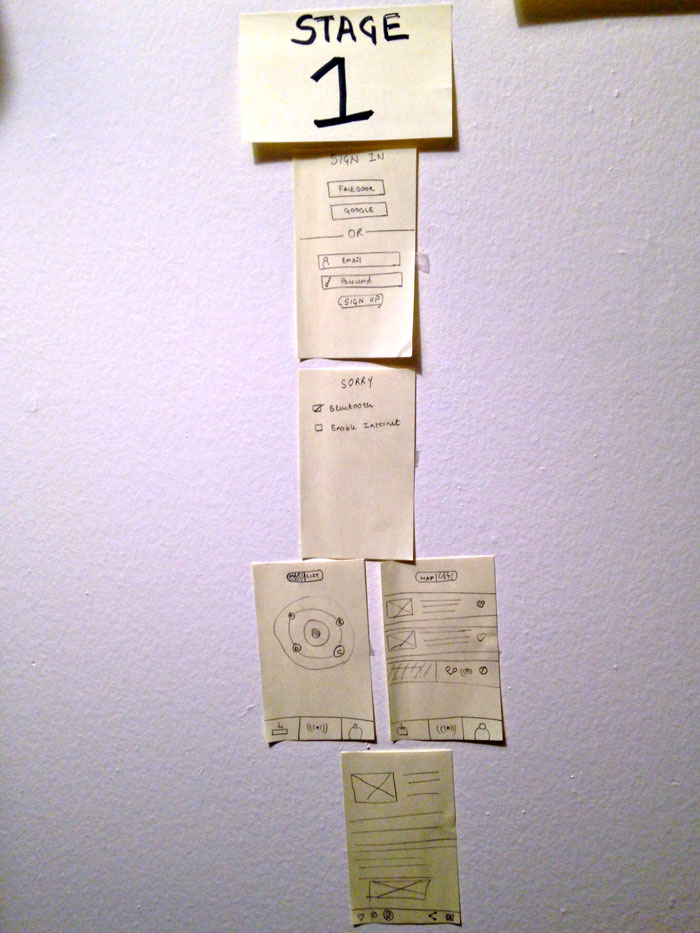
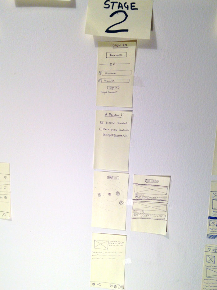
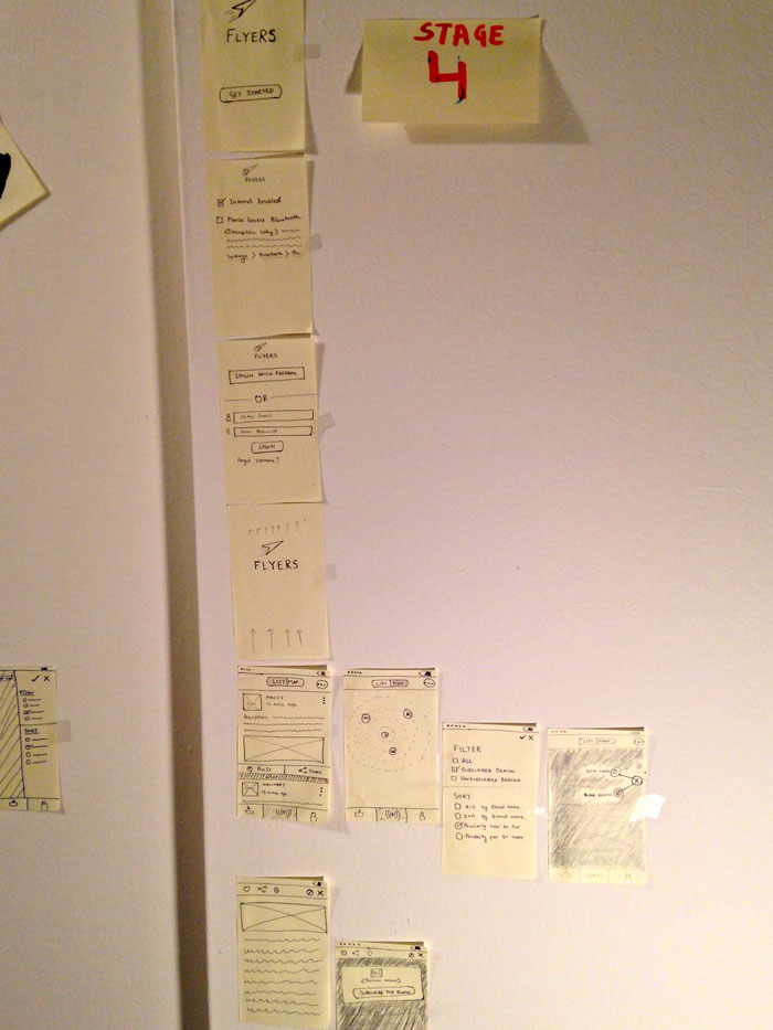
Paper Prototype
How did I find ?
Got early feedback from real users.
Hidden interactions are less intuitive.
Validated interaction flow.
Presenting Flyers
- View all marketing information based on your location.
- Conveniently save and view these information to use it later.
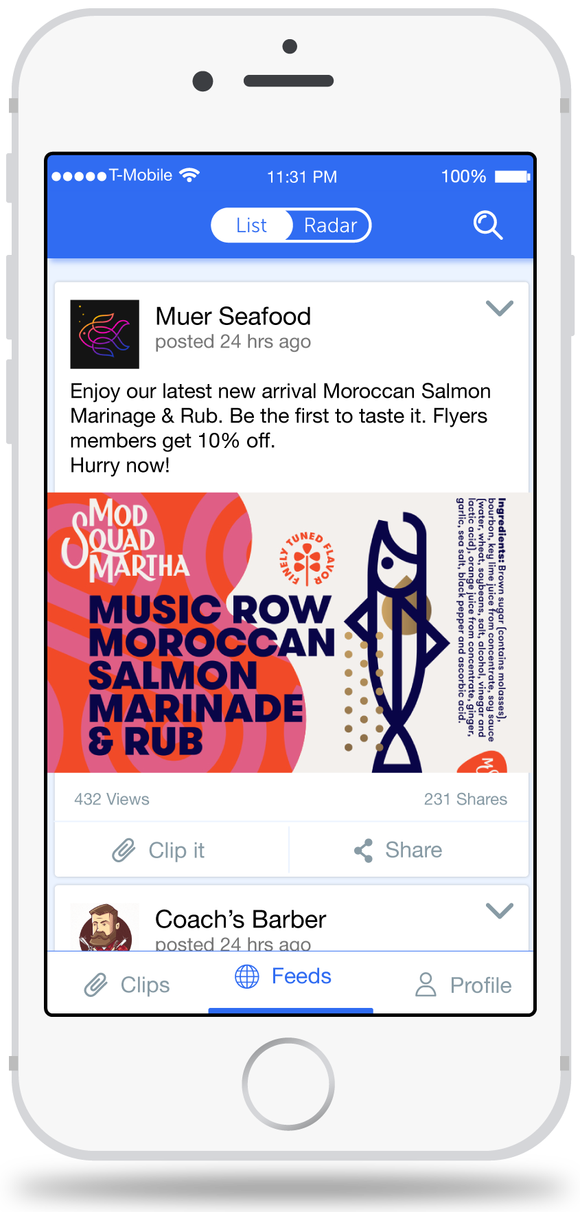
View Ads in your proximity
As a customer, view the latest advertisement near you. Subscribe if you like brands and get more ads feed.
As a businessman, broadcast curated advertisement to your customers at the right time and location.
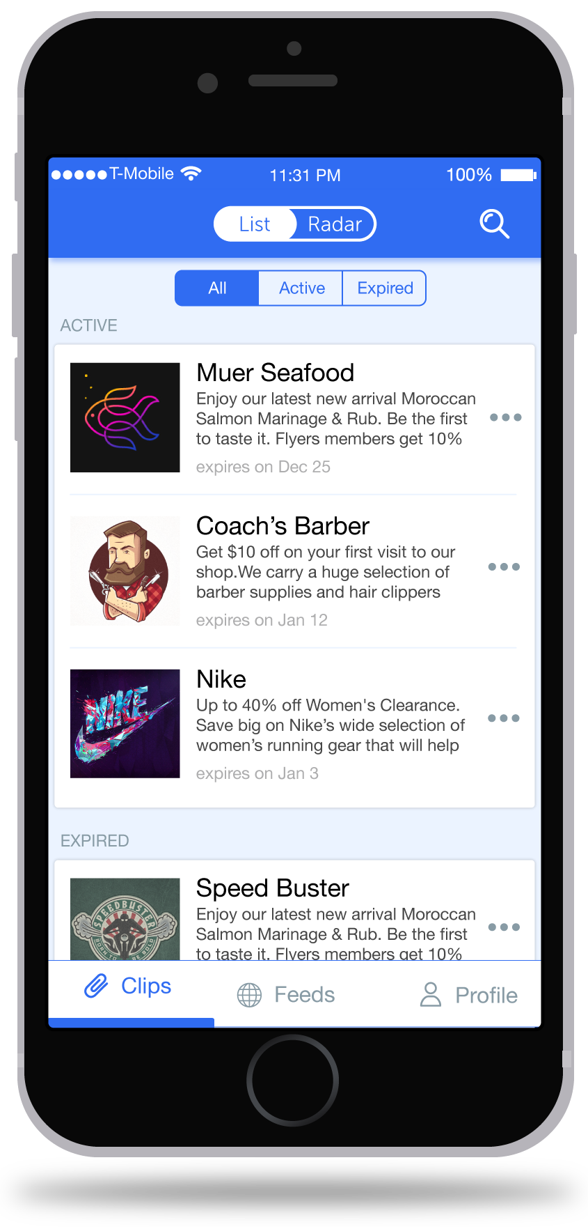
Easily Save & Fetch Coupons
Customers can save any attractive advertisement/coupons and save it on cloud.
Finding active and expired coupons/ads is now easy.
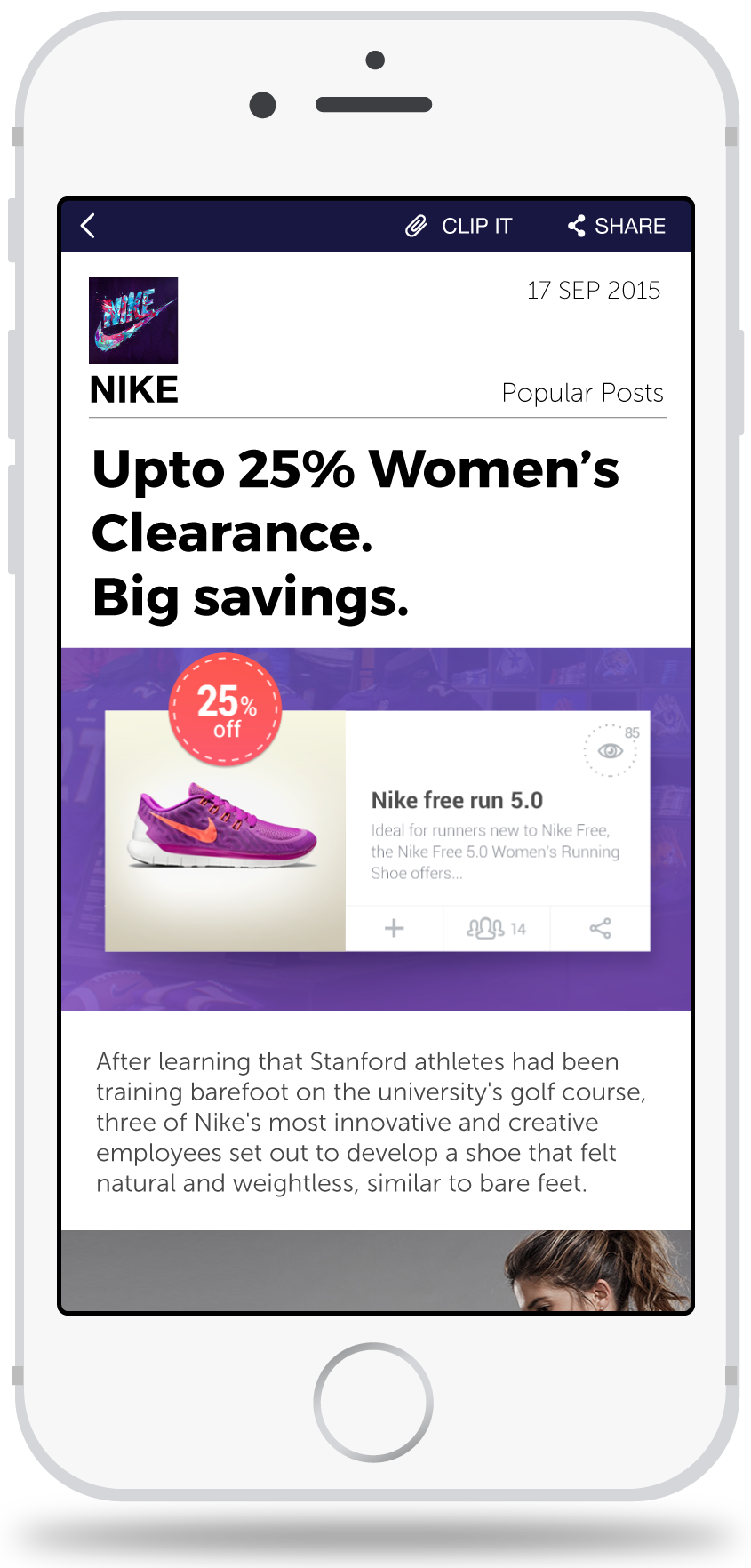
View details of any ads
Read the story behind any advertisement. Know your brands and their offers in detail.
Share it among friends or family or save it for future use.
Design Decisions
- It’s not easy to talk about design. Every problem has 'n' number of potential solutions.
- It was difficult choosing a best among these infinite solutions.
- However by following good UX practices and focusing on users' need I was able to win on the challenges.
How to present feeds?
Horizontal Scrolling
During testing majority of users did not liked it and found it fatiguing. They found it hard to put the feed in the center of screen.
Vertical Scrolling
Users immediately connected to vertical scroll because they are accustomed to similar pattern found on Facebook, Pininterest, SnapChat, etc.
Kill the hamburger?
With hamburger menu
After user testing I found that hamburger filter menu was not easily discoverable, less efficient and not glanceable.
Without hamburger menu
Users found this approach intuitive, more efficient (reduce by one click) and easy seekable.
Condensed saved feed view
Expanded view
There is little difference between current clip view and saved feed view. It is redundant to show all the information again since user has already viewed it while saving it.
Condensed view
Gives more clean view on its items. Active and expired ads helped users easily find what they want.
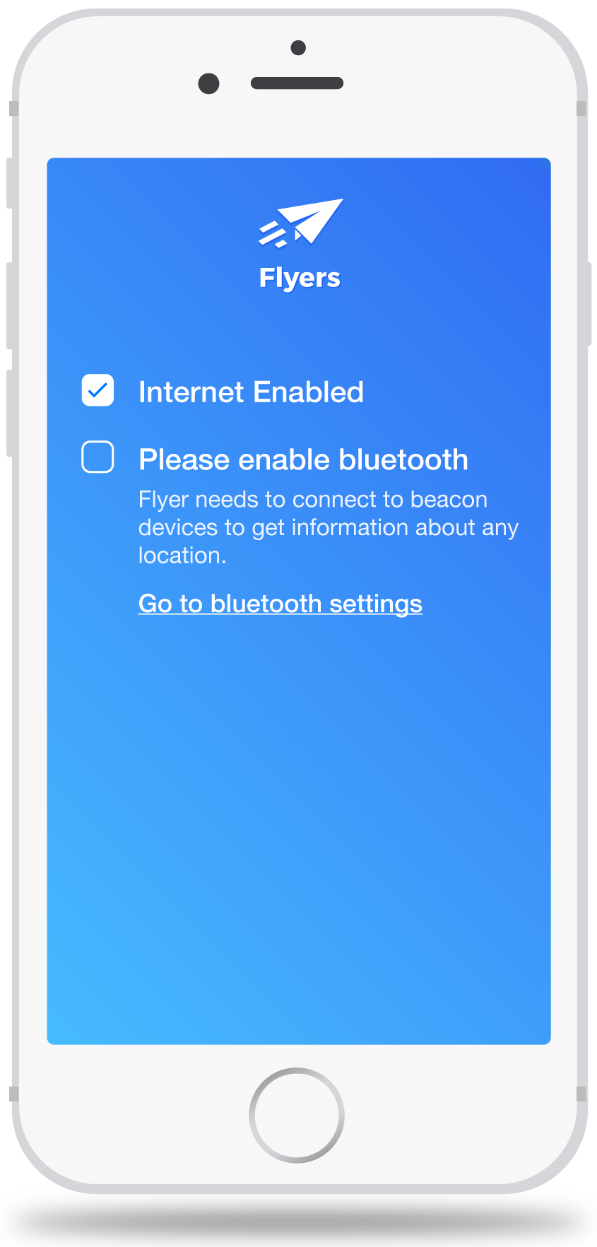
Don't make me think
A brief description on why to enable bluetooth immediately built a trust between the system and user.
'Go to bluetooth Setting' quickly navigates user to the bluetooth setting.

